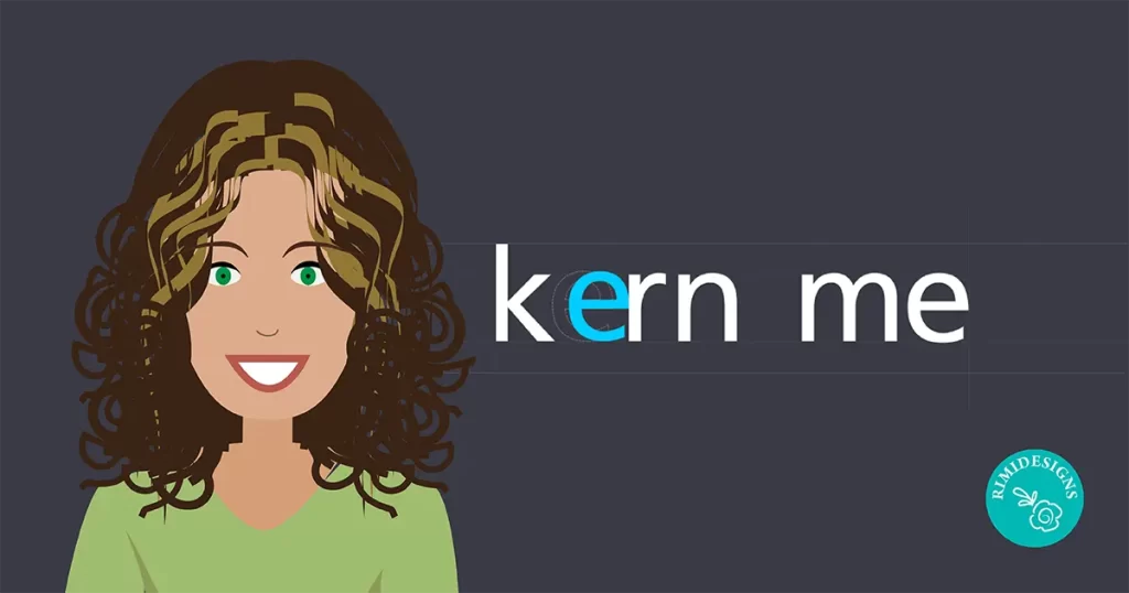
10 Kerning Tips to Improve Your Typography
If there’s one thing that’s sure to bring design pedants out of the woodwork, it’s typography. It’s an area that creatives need to pay special attention to.
Here are 10 kerning tips to improve your typography.
1. Find out what kind of fonts you’ll be using
Different fonts have different widths and styles. You can’t kern until you know what font you’re dealing with. Your headline, subhead and text will probably have different fonts.
2. Fix leading and tracking before kerning
Leading is the vertical space between lines. Tracking is the uniform space between all letters and kerning is the space between individual letters. All aspects fit together to make the design of your lettering whole. Kerning should be your final consideration.
3. Kern each letter individually
Automatic kerning features are easy to find. Everyone wants a shortcut. The fact is, the human eye is still the best tool for judging design. Make the extra effort to make your design of a premium quality.
4. It’s about visual space, not actual space
OCD doesn’t help in kerning. Your letters will only look perfect with varying distances. People will not approach your design with rulers. All that matters is whether your lettering is easy and enjoyable to read.
5. Pay attention to negative space
Letters with slanted sides (i.e. A, V, Y, W) have ton of negative space. You can lessen that negative space with next to letters that can slip into it.
6. Do your kerning in groups of 3
If you look at a word as a whole, it’s easy to miss details. Take letters in groups of 3 and kern one trio at a time.
7. Less is always more
Don’t overkern. Excessively tight letters can be unattractive and difficult to read. Rule of thumb: If it looks fine to you visually, leave it.
8. Don’t neglect the spacing between words
Letter space is important but so is word spacing. Make sure there is enough spacing between words to easily distinguish one from another.
9. Try flipping the typeface upside down
This ninja brain hack short circuits your familiarity with words. Our familiarity with words can affect us subconsciously. For example, “thin” might influence you to kern it tighter than other words.
10. Always have a least 2 versions of the design
At least have one small and one big version. This helps clients see how your work will look in different contexts. Use this to identify any kerning changes that might be required in the future.
SOURCE: Creative Bloq


