10 Typography Terms Every Designer Should Know
Typography is the art of arranging type to make the writing language more appealing to learning and recognition. This involves different techniques like selecting typefaces, point size, line length, line spacing, kerning, etc.
Typography is done by typesetters, compositors, typographers, graphic designers, art directors, graffiti artists, clerical workers, comic book artists. Some of the typographers are confused by the terms used in typography. So, here we present some basic terms that every designer needs to know.
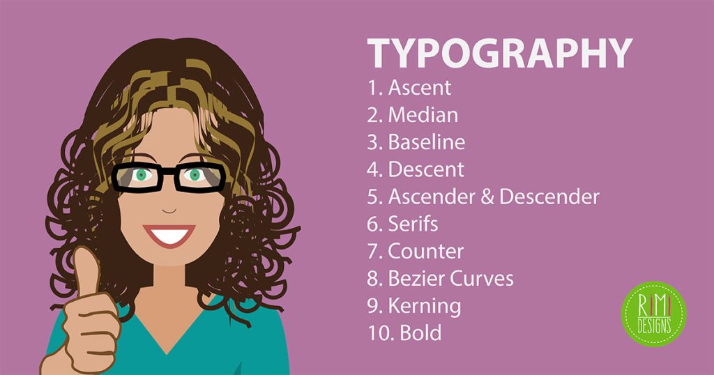
1. Ascent
Ascent is the line that the upstroke of lowercase letters should reach. This is not the same as the cap height, which is the apex of capital letters. To be clear, this is the line which the upstroke of the letters like b, f and l touches.
By now, you might have got the difference between cap height and ascent. In some fonts, the ascent is taller than the cap height. In fonts like Blake, the cap height is taller than the ascent. In some both can be same.
2. Median
Median is the same as x-height. The line which the lower case letters without ascendants should reach. It is the height of x in your font.
Fonts like Carbito Sans keeps strict median. This gives a very calm and controlled feel.
3. Baseline
Baseline is the lowest point of all capital letters and the lower case letters without descendants. Whatever the font is, all the capital letters just sit on the baseline.
4. Descent
Descent is the line which the lower case letters with descendants (strokes that go below the baseline) touch. The letters like p, y, j touch the descent.
5. Ascender and descender
Ascender and descender are the upward and downward strokes that touch the ascent and descent respectively.
Ascender is the upward stroke of the lowercase letters like d, b and f. Descender is the downward stroke of the letters like q, p and j.
Ascender and descender are only for lower case letters.
6. Serifs
These are the finishing strokes at the end of characters. Serifs are the semistructural details on the ends of some strokes of letters and symbols. Fonts that lack serifs are sans serif or simply sans.
7. Counter
This is used to describe the space inside the letters like O, A, S and H. The presences of these types of letters cause the fonts to look taller than they really are. So font styles deal well with these types.
8. Bezier curves
These mathematical curves are scaled to any size. They play an important role in making fancy serifs and tails on characters. Computer typography needs them a lot.
9. Kerning
Kerning is about controlling the spaces between letters – that includes those between words. Kerning describes the act of adjusting the space between characters to create a harmonious pairing.
For example, where an uppercase A meets an uppercase V, their diagonal strokes are usually kerned so that the top left of the V sits above the bottom right of the A.
Kerning and tracking are sometimes used interchangeably by people who don’t really understand typography. Tracking is different, as it relates to the spacing of all characters and is applied evenly.
10. Bold
Bold is one of the most important and style attribute. It basically attracts attention to all major important and significant parts of a webpage.
Apart from this, it is used to scan the page quickly to get a list of the material in the hands. The use of bold style makes it easy to access the information.
SOURCE: Acodez


![[VIDEO] What Is Graphic Design? [VIDEO] What Is Graphic Design?](https://www.rimidesigns.com.au/WPsite/wp-content/uploads/2018/02/Rimidesigns-Graphic-Design-270x270.jpg)
