4 Easy Font Pairing Ideas
Typography is a huge part of graphic design and type matters on all of your marketing materials. But how do you make your typography look professional?
If you have ever experimented with typography, you know it is more than just picking random fonts. There are style guidelines in place to make sure your design looks great and not like someone threw up fonts all over your design.
Below are 4 easy font pairings to follow.
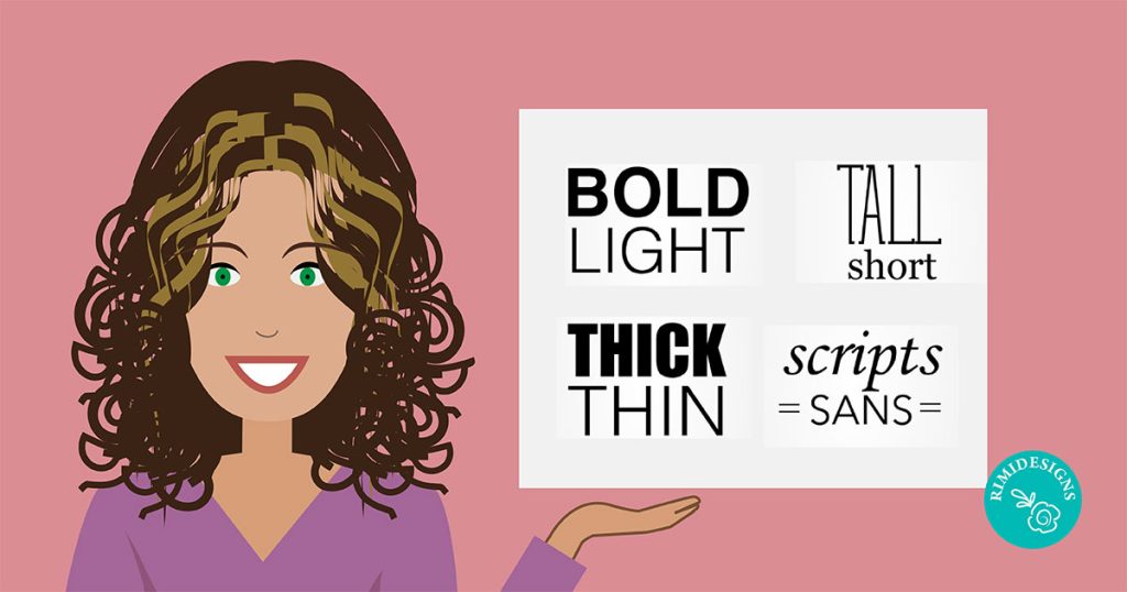
1. Light and bold
Same font, different styles
To produce beautiful typography, you don’t even have to use different fonts. You can simply use the light and bold versions of the same font family.
2. Tall and short
Pairing tall and short fonts offers your design a balanced attractive look. The tall font is going to be read first, so make sure that is the font you use for the words you want emphasised.
3. Thick and thin
Different fonts
Mix a thick and thin font when you really need something emphasised. This pairing looks extra great if the chunky font is condensed and the thick font has wide spacing.
4. Scripts and sans
Mixing scripts and sans will give you an elegant design without making it overwhelmingly girly or weddingesque.
Above all, make sure your design is readable.
SOURCE: Allee Creative


![[VIDEO] The Universal Arts of Graphic Design](https://www.rimidesigns.com.au/WPsite/wp-content/uploads/2018/01/Rimidesigns-Salvador-Dali-270x270.jpg "[VIDEO] The Universal Arts of Graphic Design")