4 Simple Ways to Design Killer Call-to-Action Buttons
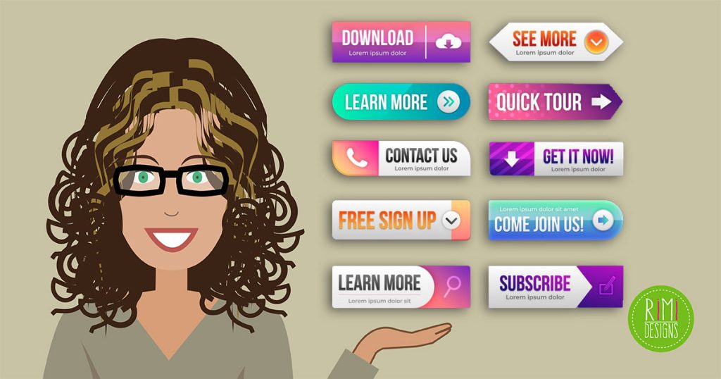
Call-to-action buttons that are easy to see and understand will make a huge difference to your website’s conversion rates. When designing these buttons, it’s imperative to consider a wide range of factors. Some of them include the colour, contrast, button copy and even whether or not to include some directional cues right beside the button.
In short, for an element that takes up a small spot on your web page, you’ll have to invest a disproportionate amount of time thinking about how to best present it to your users.
Yes, call-to-action buttons are that important. They are, after all, the stars of a page, whether they’re meant to get website visitors to buy something, sign up for something or just click through.
Call-to-action buttons represent the goal of your page. Every page should have a goal. Take a landing page, for instance, the goal is to get leads to click through to the main product or service page. An intelligently designed button that takes into consideration how your visitors want to buy or sign up for something, is what every designer ought to be striving for.
1. Directional cues
As human beings, we’re just hardwired to respond to eye direction as a powerful way of cuing us. Think of it. When you see someone looking at something not in your field of vision, you’re automatically curious about just what he’s looking at.
Yes, directional cues can be the more obvious arrows and even fingers pointing at call-to-action buttons. But for something truly unique and relatable to your website visitors, go with a picture of a person looking at your call-to-action buttons instead. You can’t go wrong.
2. Really simple button design
When you make your buttons as simple as possible, you eliminate chances that your website visitors, buyers and readers will get confused. When they get confused, they usually won’t follow through on the action that your button copy wants them to. So keeping the website’s button design minimal is what you should aim for.
3. Well-defined microcopy
Microcopy is the star of the cal-to-action because it uses action-oriented verbs to inspire people to move. The amount of real estate that you have to plan intelligent labels is very limited, so microcopy has to be short and to the point. Microcopy that lets website visitors know exactly what they’re clicking on is a winner because it doesn’t waste their time.
Sometimes, microcopy can be neglected, which is unfortunate. In spite of all the attention given to the button design, colours and affordances, the copy shouldn’t have to suffer. Websites whose microcopy suffers are sites whose conversion rates suffer, too.
You know you have successful microcopy when you have different call-to-action buttons next to each other, yet website visitors can instantly tell what the purpose of each button is.
4. Colour contrast
Shoppers are an unreliable bunch, which is why the user experience has to be tailored to them. In other words, buying something from your e-commerce store should be the easiest and clearest thing in the world. Something as basic as colour contrast can vastly improve the shopping experience for website visitors.
Colour contrast that works can draw your shoppers’ eyes to the call-to-action button and make it stand out from an otherwise noisy background. When shoppers can easily find what they need to click on to make a purchase, obviously a website’s conversion rates are going to shoot up drastically.
The bottom line
Call-to-action buttons are vital to how much money your website will make. We have to realise that our goal should always be to support more conversions. For e-commerce websites, that will be sales. For news websites, that will be sign-ups to things like newsletters and the like.
The point is, that conversions matter most and call-to-action buttons have to support this goal all the time. That’s why a great deal of thought has to be invested in designing a call-to-action button. Even though it occupies a really small space on a web page, its importance is immeasurable. Anything from the colours to the button copy to any directional cues nearby will make or break its effectiveness.
SOURCE: Webdesigner Depot
Need a professional looking website?


