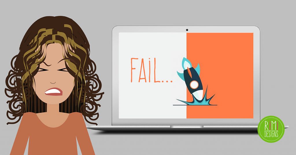
6 Reasons Your Website Fails to Get the Point Across
Every website tries to communicate a different message. However, with some websites, it is hard to determine what exactly that message is.
Here are 6 things that detract from the individuality of a website, as well as failing to get the point across.
1. Images of people
Stock images of people looking absolutely captivated by their computers, with their loved ones supportively looking over their shoulders, eagerly pointing at the screen. We’ve all seen these images, and that’s the problem! There’s nothing unique or attention grabbing about it.
While many companies may think that these images add an appealing human element or are descriptive of their businesses, there are more memorable and relevant ways to relay these ideas, which is where creativity comes in.
Solution:
If you want to attach faces to your business, make it of real people actually involved/working in the business.
2. Keywords
“We specialise in optimising scalability, honing technology functionality solutions and calibrating accessibility. All with unsurpassed innovation.” Go ahead and try to pick out all the keywords in this example pitch, then ask yourself: If you saw this on a company’s website, would you be intrigued or just plain confused, wondering what services they offered?
A business should be able to outline what it has to offer, without the use of ambiguous keywords meant to add flair. Make a lean pitch that gets to the point, without polluting it with sensationalist keywords.
Solution:
Short, sweet and straightforward will be more memorable to potential clients, as well as show that you value their time and intelligence. Feel free to jazz it up with some extra vocabulary, but try to avoid industry cliches.
3. Cheesy designs
Photoshop can be an invaluable tool in making a website look good. But being able to use basic elements of the program, does not always translate into a beautiful end result.
Solution:
You don’t need to apply every Photoshop filter to achieve the ultimate design. Sometimes minimalism works best. Use subtle techniques that up your design, without taking away from it’s purpose.
4. All talk and no visuals
You know that phrase that everyone loves to use? A picture is worth 1000 words? That holds true to web design, as well. Long pages of text are daunting to look at and most people won’t read more than a paragraph or two. Be deliberate, not wordy.
Solution:
Break it up with pictures, video or great graphics.
5. Stock images
Stock images are a great side dish, but they shouldn’t be the main course in your web design. They are common and non exclusive, and in most cases, anyone is able to buy the same photo, which can lead to duplicates of the same picture on different websites. If you are trying to establish your online identity, why use the same images as your competitors?
Solution:
If you’re going to use stock images, take special care to keep it relevant to your website and avoid ambiguity. If the terms of use allows for editing, fit the photos into your homemade graphics as accents. Take a little creative license to personalise the images you do use. Instead of just having a computer monitor to symbolise a software company, try editing in a screenshot of your software on the screen and make it your own.
6. The “Now what?”
When someone visits your website, they should not feel like they need a map. Many times a homepage can contain an array of links and graphics but lack a distinct next action for the visitor to take. With no direction, despite any cool graphics that might be present, your website will get little more than a fleeting glance. Users should feel guided, as though they are being led on a tour of your business, driven to keep clicking or scrolling, because it is what they are being led to do.
Solution:
Always give your visitor a beginning point and make sure there is a hierarchy to your content. Use action words in your navigation to command the user. Don’t leave it up to them to decide where they should begin. Take their hand and guide them towards the desired goal you have for them.
Need a professional looking website?


