7 Steps to an Effective Landing Page
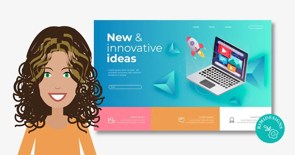
A landing page is an effective way to drive sales for any business. The majority of websites share a similar range of assets — About Us pages, Contact pages, etc. But a great landing page is something that takes time to produce.
Landing page designs will vary, depending on the industry that you’re in. However, most effective landing pages have a few key elements in common that make them successful.
1. Negative space is key
A cluttered landing page will confuse your message. Sure, your landing page can have tons of information on it, but organise it and break it up into manageable chunks.
2. Page layout and placement of elements
It is important to have your most high impact visuals above the fold or where the viewer can see when they arrive on your landing page. Have a video, a few important bullet points and a direct call-to-action above the fold. You’ll find this on many effective sales and marketing pages.
Below the fold is a good place to expand on the product or service that you’re offering. Just remember to keep the layout consistent and clean.
Like in our previous point, too much clutter can clutter your message, too. If the visitors don’t have an easy path from one content section to another to follow, they will get frustrated and just leave the website altogether.
Break up long content with variations, such as having a section of bullet points for benefits and then a section of icons or graphics to keep it interesting. In short, mix it up a little.
3. Invest time and/or money in great imagery
With any web page, especially a landing page, you want to make sure that you use images that grab the visitors attention. One of the strongest ways to make a connection with a visitor is to use a powerful, emotional connection with them.
4. Include a powerful call-to-action
People need to be told what actions to take. The landing page itself is meant to inform and get them hooked. The call-to-action is meant to tell them what the next steps are, such as entering their email address or clicking a button to sign up or learn more.
A call-to-action should always stand out, whether they stand alone on the page or they are overlaid on top of an image. The text should contrast well with the button or background as well. Clarity is a major factor with any call-to-action. You can lose a lot of potential customers by not being clear on what you want from them.
5. Use practical, trustworthy colours
The psychology of colour is important, especially with a landing page. Any time that you are asking something of anyone, they are immediately skeptical. You want to use colours that represent good qualities.
For example, blue is a great landing page colour, because it represents things like cleanliness, freshness and tradition. Green is also another popular colour for landing pages. The reason that green works so well is because it is associated with growth, money and life. Colours like yellow and red are usually avoided because of their connections with fear, cowardice and anger. However, this is all a matter of context as well.
6. Social proof wins
Testimonials can make a huge difference when it comes to conversions. When you are trying to convince others to do something for you, whether it is giving you their email address or signing up for a monthly subscription, it’s tough to build trust.
When you place testimonials from others that talk about how the product or service benefitted them, it gets the reader to place themselves in their shoes. The reader will ask themselves, “Do I have problems like these?” If they do, then they will be more likely to see that it will work for them too via comparison. Being able to identify with your target market and solve their problems is a great way to get conversions.
Also, psychologically, no one wants to be the first person to do something. If they see that other people in similar circumstances have taken the leap and it worked for them, then they should see the same results.
7. Video can be very persuasive
Using a short promotional video can dramatically increase conversions on your landing page. A short, professional video is quicker and easier to watch than read the copy. Some people won’t stick around to read a lot of text. However, if you have a compelling video, it is more likely to draw them in and they are much more likely to stick around and read the text to find out the details.
Video also helps to build a personal connection with your visitors. Seeing a face or hearing a pleasant voice is a much nicer experience than reading a long page of sales copy. It also gives them the opportunity to see your product or service in action during the video.
SOURCE: SitePoint
Need professional assistance creating a great landing page?


