Creating the Right Navigation Menu for Your Website
One of the make or break elements of your website’s design and usability lies in how you’ve created your menu. Like road signs on a highway, your website visitors rely on your menu to navigate your website and find the exact information they’re looking for.
No matter what direction you’re partial to, from vertical to horizontal, scrolling or icon based, the right menu will take your website visitors where they need to go.
1. Horizontal menu
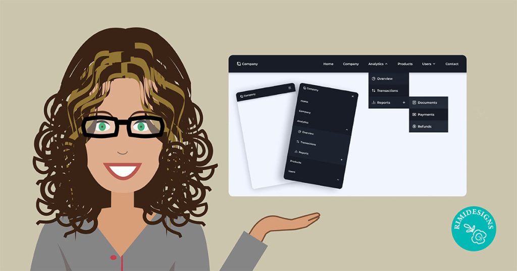
Horizontal menus are the default choice for website creators around the world, and for good reason too. If you’re catering to a crowd that wants to find their bottom line, without fiddling around with new-fangled menu choice, look no further.
These user-friendly units are a staple on the top of website screens from browsers to favourite blogs, so navigating with them is near foolproof.
This menu is also the best option if you have a long list of submenus or dropdowns under each main menu category.
2. Vertical menu
Looking to switch things up from the classic? Vertical menus are becoming an increasingly popular option. Often found on the left-hand side of a website, this is an attractive design alternative that won’t leave your website visitors bewildered.
They’re a popular choice for blogs because they leave a large, open canvas of space in the middle of the web page.
Pro tip
If you do go vertical, make sure to keep your page names short. You don’t want the page titles to take up precious real estate in the middle of your page.
3. Fixed header menu
If you have a long website, with loads of information to captivate your readers, a fixed header menu might be meant for you. This menu style freezes your header in place so it’s always in view, regardless of where visitors are on your website.
Fixed-header menus make it easy for website viewers to find their way around your website and click between different pages. Place your logo and contact details on your website menu, so that viewers can find that critical information at their fingertips.
4. Floating anchor menu
If you’ve been surfing on the internet lately, there’s no hiding from floating anchor menus. The perfect companion for long-scroll and mobile websites, anchor menus allow website visitors to jump to different sections of your website, with just a click. And because anchor menus are floating, they are always visible wherever your website visitors are on your page.
5. Icon menu
A picture is worth a thousand words, which is why an icon menu can be so powerful. Rather than writing “Homepage” and “Contact Us”, try using an image of a house and an icon of an envelope. Want readers to check out of your store? Use a picture of a shopping cart to tell them where to click.
Icon menus are a great way to make your website memorable to visitors and show that you’re a little bit different. But do keep in mind that they may be a bit confusing to less tech-savvy users.
6. Bottom-page menu
Feeling a little rebellious? Give your website viewers a taste of the unexpected by putting your menu at the bottom of your page. Because of the switch in design flow, this style is ideal for websites with a cleaner look with just one focal image on the page.
Pro tip
Add a pop of colour to your bottom menu to make sure it doesn’t get lost in any clutter.
SOURCE: Wix
Need a professional looking website?


