Understanding the Use of Colour in Design
When you are branding your product, looking at the colour used in the design is key. Different colours symbolise something different in every country thus enticing different emotions.
Before you get started, understand your target audience – whether they are young, old, male or female – and then look at your product and realise the feeling you want to bestow on others. Figuring out which colours work well together isn’t just a matter of chance, there is actually a science behind it.
There have been proven studies on how colours effect emotions. For example, blue has been proven to bring down blood pressure and slow your heart rate. Yellow is a colour that often makes people feel happier, so if you combine blue and yellow you get green, which is a very pleasing colour to most. Pastel tones are often used in mental health units as they are known to help patients feel calm, happy and relaxed. If we look at the other end of the spectrum, schools tend to use brighter colours that appeal to children, such as bright red, yellow and green.

The colour wheel
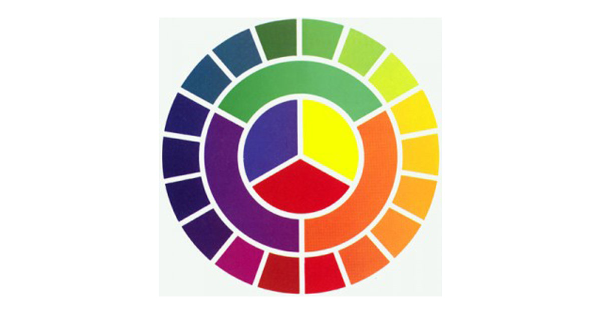
A colour wheel, based on the primary colours red, yellow and blue, is traditional in the field of art. It was Sir Isaac Newton who developed the first circular diagram of colors in 1666. Since this time, scientists and artists have studied and designed numerous variations of this concept.
Lets break it down.
Primary colours: Red, yellow and blue
In traditional colour theory, primary colours are the 3 pigment colours that cannot be formed by any combination of other colours and all other colours are derived from these primary colours.Secondary colours: Green, orange and purple
These are the colours created by mixing the primary colours.Tertiary colours: Yellow-orange, red-orange, red-purple, blue-purple, blue-green and yellow-green
These are the colours we create when we mix a primary and a secondary colour. That is why the hue is a two-word name, such as blue-green or red-violet.
Choosing colours
When deciding on colours, you must make sure they are harmonious and pleasing to the eye. You don’t want to choose a colour combination which is too chaotic or that is boring, where the brain will just dismiss it.
When choosing the colours you want to play with, look at analogous colours or complementary colours.
Analogous colours are any 3 colours which sit side-by-side on a 12-part colour wheel, such as yellow-green, yellow and yellow-orange.
Complementary colours are any 2 colours which are opposite each other, such as red and green and red-purple and yellow-green.
SOURCE: You the Designer


