Basics Behind Colour Theory in Web Designing
This basic overview covers the general aspects of getting started in colour theory. Understanding the vast number of options available to you as a web designer is important for creating top quality artwork.
Beginnings of colour theory
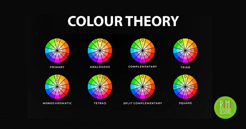
When starting off into the pool of colours, we should base ourselves in square one. After breaking through all the mixes, we are left with only 3 primary colours. These are red, blue and yellow and they are the root ingredients from which all other colours manifest.
These primary colours may be combined together in a mixing process to create other colour schemes. These are known as secondary colours and will always contain a mix of 2 primaries. These 3 secondary colours are orange, violet and green. This colour scheme is based off the sample default style.
When you start designing for web and print, it may be required to switch between different colour models. These include RGB and CMYK, which are notoriously utilised in digital and print design, respectively.
Tertiary colour pallet
Once we have our colour wheel started, we can use these resources to create tertiary colours. This group holds a second layer beneath primary/secondary, which is created when mixing between all 6 original colours.
With this we are now able to create 6 brand new colours (2 from each primary). This will give out a blend of 12 colours in total. At this stage we are able to design a full pallet and fill in a 12-sided colour wheel.
Monochromatic colours
When delving into colour schemes, we can find an endless supply of creativity. This realm holds the possibility to create hundreds of different colour pallets, all with varying intensities.
Monochromatic colour schemes are the raw colours, as they only refer to a single hue. This can be green, blue, orange, aqua or whatever fits best into your design. These are commonly seen with branding and background patterns to fit into an existing pallet.
In this reference, colours are usually created by dimming opacity between each colour (or hue) and a background. The most common example is creating an alpha channel and adding more white/black into a selected hue at varying degrees. Through this method you are able to design a useful monochromatic colour scheme to blend into simple digital graphics.
Analogous scheme
These colours are put into a generation based on their location on the standard colour wheel. Analogous sets are created by points located directly adjacent to each other. Common examples include green/yellow-green/yellow or red/orange/yellow.
These are 3-part schemes, also known as a base triad. You may combine 2 analogous schemes together to create a hybrid set. Often analogous sets are found naturally and promote a pleasing sight to the eyes.
Between the 3 colours, it’s generally common to assign roles in a design piece. One of the 3 is used as a base to hold the project together. The second is an accompanied colour and the third is referenced as an accent. This effect can be used to create contrast and vibrant edges or shadows.
Complementary themes
Colours residing in opposing positions on the colour wheel are known as complementary. They naturally complement each other and provide an equal level of energy to a piece of art.
Examples of these include red and green, purple and yellow or blue and orange. These colour schemes will create a high level of contrast between elements. They are great when used in illustrations to highlight a piece of scenery or cartoon character. The matches can become very overpowering, so do use them sparingly.
Text will often perform well over high-contrast black/white but is best rendered with slightly less saturation. In this way, text off the page won’t hurt the readers’ eyes but is still easy enough to follow.
There is also a second lesser-known scheme titled split complementary. This contains a base colour, which also brings in 2 colours opposite the spectrum. It’s derived by the 2 adjacent neighbors to the base complementary.
As an example for a split complementary with red as our base, we would need both adjacent colours beside green (but not including green). This would target green-yellow and blue-green. This pair provides the benefits of a high-contrast ratio without the jagged tension from a strictly complementary relationship.
Often, these can be difficult colour schemes to balance out. The base colour of choice is usually located in the warmer region, so you have 2 cooler colour options for highlights, backgrounds and smaller graphics.
Triad colour sets
The triadic colour scheme is one of the most popular amongst designers and this is especially the case for digital artists. This scheme uses 3 colours which are equal distance from each other on the colour wheel.
As common examples we could include red, blue and yellow or orange, purple and green. We derive this by picking our base colour (red) and moving 3 equal paces over to the right. Once we hit this (blue) move 3 more units clockwise to hit yellow, with just 3 more placements separating between red.
Triads create a sense of equality and security. In most cases, you’re pulling an even distribution of colours out to balance graphics and icons nicely. These can be used to create beautiful artistic illustrations of towns, oceans, forests and many other scenes as well.
SOURCE: Hongkiat


