What You Need to Know About Responsive Design
There is nothing new about responsive design, having been around since 2010. Responsive design is everywhere nowadays, and we can thank the growing mobile device industry for that.
What is responsive design?
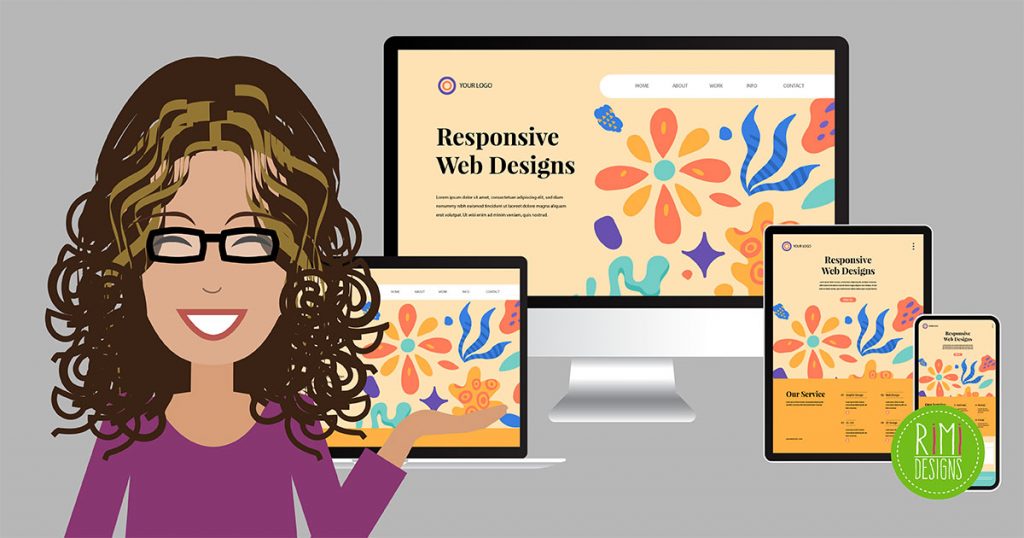
Before anything else, you need to have an understanding of what it means for a website to be responsive. A responsive website is one that adjusts to the display size of the visitor’s device.
Because of the rise in smartphones and tablets, designers had to come up with a way to ensure that their websites looked just as good on the smaller screens, as they did on a full-sized desktop monitor. To do this, media queries are used to detect the device or the resolution of the visitor’s device, a combination of flexible images, type and grids adjust the display to fit the screen.
Responsive design is not the same as mobile-friendly
Mobile-friendly websites were seen as one solution to the growing mobile trend. Visitors who arrived at a website from a mobile device were redirected to a completely different URL for the mobile version of the website. This meant that two websites needed to be created and maintained.
The responsive route only requires one website to be developed.
A love affair with fluid grids
Fluid grids help everything in the responsive world work. Start by defining the maximum layout size for the website (usually 1024 px to fit most monitors). The page is then divided into a specific number of columns. Each element is designed with proportional widths and heights, instead of pixel-based dimensions. So when the device or screen size is changed, the elements will adjust their widths and heights by the specified proportions to the container it is in.
Images and typefaces need to be responsive too
Adding an image to a responsive website doesn’t automatically make it responsive. The same goes for fonts. For images, the best results come from script solutions. Many responsive WordPress themes have built-in capabilities for responsive images, as well. Type can be responsive by using rems, instead of px or ems to define size.
Frameworks can make things easier
In the world of responsive design, there are frameworks that you can use to structure the layout of your webpages. Essentially, they are similar to templates in the sense that they provide the designer with a foundation to work from.
Frameworks predetermine your grid, typography, navigation layout, buttons styles, tables, etc. The best part is that they have already gone through testing to ensure that they are compatible with the popular browsers.
Frameworks vary from fully functional options to bare bones choices. Some will even include a CSS file that can be changed to match the look and feel for the website without having to code this entirely from scratch.
Emails can be responsive as well
Just as with websites, the number of emails viewed on mobile devices is rising steadily. To make sure that HTML emails look consistent across the different devices a recipient might have, many people have turned to responsive design principles and frameworks to help them design these messages. This practice is becoming so popular, that a number of frameworks include an email option as well.
SOURCE: Web Design Library


