How to Create a Simple Brand Style Guide
When it comes to branding, consistency is key. From customer service interactions all the way down to Twitter avatars, consistency breeds familiarity. And that means stronger connections to your brand.
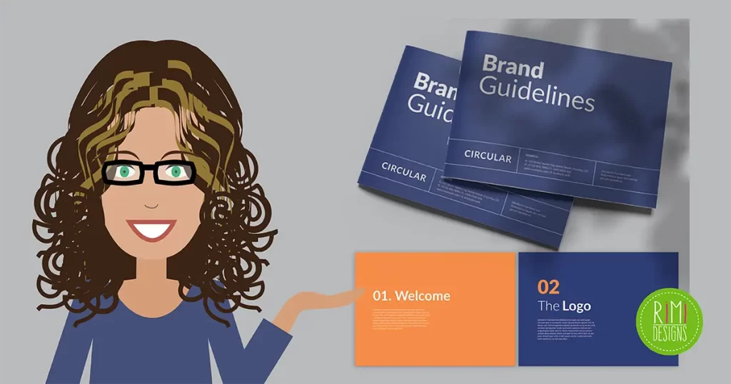
The easiest way to keep things visually consistent, especially as your business grows, is through a brand style guide. Sure, some style guides can rival the thickness of your favourite novel, but don’t let that overwhelm you. A simple one-page reference may be all you need. The important thing is that it lists all your basic brand elements and can act as the singular point of reference for any future design project.
Below are 5 elements you’ll want to include in your style guide.
1. Brand overview
Start with a quick summary of your company. Designers can keep this in mind when creating anything new.
- Mission: In as few words as possible, define why your company exists and where you want your brand to go.
- Target audience: Describe who your customers are and how your products or services are solving their problems.
- Personality: Create a list of 3-5 adjectives that define your brand. This will set the tone for both design and writing. Think of words like sophisticated, quirky, rugged, hip, etc.
2. Logo variations
Include all the versions of your logo (e.g. colour, reversed, black and white) and describe when and where to use each one. List the minimum size and proper proportions of your logo to prevent any stretching, altering, condensing or re-aligning. If your logo requires a certain amount of white space around it, note that here as well.
3. Colour palette
Show swatches of your brand colours. Include the Pantone numbers so designers can easily use the precise hues in new materials. Create a consistent look by sticking to no more than four main colours in all your materials and don’t stray too far from the hues of your new logo. It’s a good idea to pick one light colour for backgrounds, a darker colour for text, a neutral hue and also one that pops.
4. Typography
Include all your brand-approved fonts and describe when each should be used. Again, stick to no more than four. Don’t use the exact same font that is used in your logo — it’s earned the right to stand out. Think about choosing one font for headlines, another for subheads, a third for body copy and a fourth for important call-to-actions.
5. Imagery
If you have a certain look for photos or illustrations, be sure to include examples. This can also help you begin building an image library.
SOURCE: 99 Designs
Rimidesigns’ Business Starter Pack is designed to get you up and running as quickly as possible and is a great way to promote your business and services online. Includes: logo design, business card design and single page website.


