How to Create a Basic Brand Style Guide
Most companies use a brand style guide – a book or document that sets rules on how the brand is visually presented to the public. These rules instruct employees how to properly use and communicate a brand’s visual identity, from proper logo usage, the brand colour scheme, the look of the website and print materials and much more.
There are many visual assets that make up a brand style guide. However the core visual asset of any brand is the logo. It’s a good foundation upon which to start building a complete brand style guide.
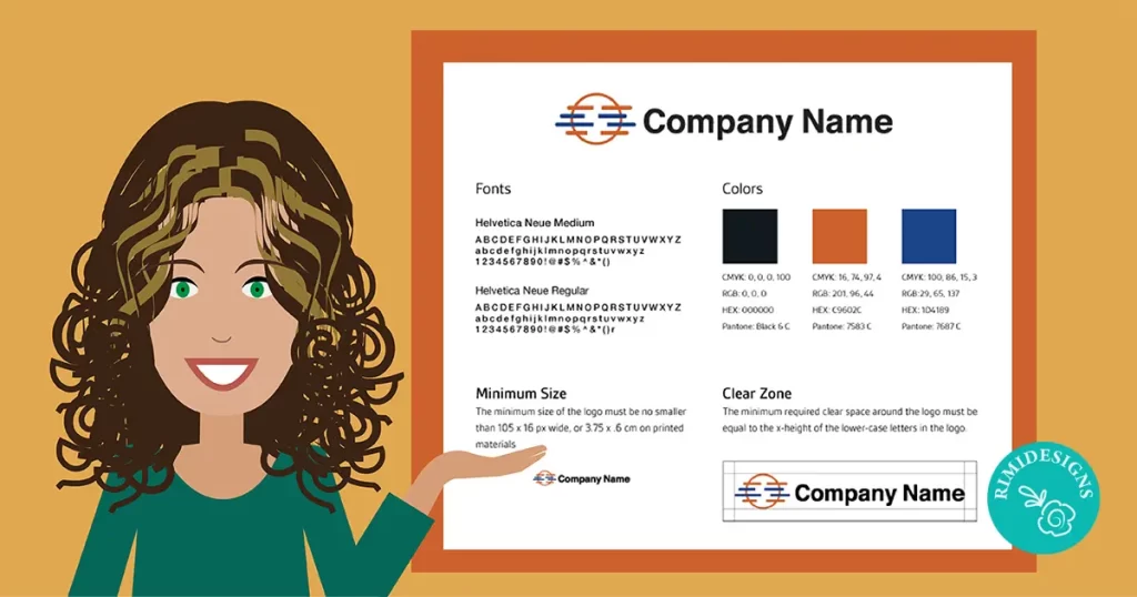
Above, we’ve included four pieces of information about a logo that make up a basic style guide: fonts, colours, minimum size and the logo clear zone.
Let’s go through each one and how to determine that information.
1. Fonts
For this example, we chose Helvetica Neue Medium for the typeface. The typeface of the logo sets the tone of voice for a brand and is supposed to visually convey a brand’s values.
By giving your client the font information in the brand style guide, you can ensure that they can obtain the proper licenses to use the font.
2. Colours
By giving your client the logo’s colour information, you’ll ensure that the logo colours will look consistent across all mediums.
Clients are likely to use the logo both on screen and in print, so it’s important to given the CMYK, RGB, HEX and Pantone colour codes for the best colours results.
To find out this information, create your logo with CMYK colours first, select each single colour in the logo and double-click on the colour picker swatch. A window containing the CMYK, RGB and HEX colours codes in them will appear.
Note: It’s not always necessary to include the Pantone colours of a logo, but a lot of clients ask for them because they want that information for an offset printing job. However, it’s a pretty simple conversion from CMYK to Pantone, so you might as well include that information just in case.
Here’s how to make this conversion in Illustrator:
- Select your logo
- Edit > Edit Colors > Recolor with Preset > 3 color job (there are 3 colours in this logo)
- Select a Pantone Library (for example Pantone + Solid Coated)
- Click OK.
Next, you’ll see 3 new Pantone swatches appear in the swatches panel. To find the swatch number, click on the coluor swatch and you’ll see the number appear in the Colour Panel. Now you’ve got your Pantone colour information.
3. Minimum size
Setting a minimum size for the logo in your brand style guide will make sure that the logo is always clear and legible.
In this example we’ve set the minimum size to be 105 x 16 px for screen and 3.75x.6 cm for print. Minimum size depends on the shape and design of the entire logo, so use your best judgement.
4. Clear zone
All logos need clear zones around them in order to be the most effective. This clear zone must always be free of any other imagery, graphics or typography, in order to preserve the logo’s integrity and legibility.
In this example we’ve used the x-height of the lower-case letters in the logo to define the clear space around the logo.
These examples are just some of the most basic building blocks of a brand style guide. Taking this small extra step in handing over your designs to clients will save you time because you’ll be giving them information that they won’t have to come back and ask for and you’ll be ensuring that they don’t misrepresent your hard work when they’re applying your logo design to their branding.
SOURCE: 99 Designs
Rimidesigns’ Business Starter Pack is designed to get you up and running as quickly as possible and is a great way to promote your business and services online. Includes: logo design, business card design and single page website.


