The Beauty of Using Two Colours in Graphic Design
Nowhere is the trend of paring down to simple workable solutions more apparent than in graphic design. Even while technology has provided exciting and expensive new means to create compelling, complex images, type and layouts (not to mention the development of new inks, varnishes and papers), designers have been thinking in a reductive way. But how much can be removed from a design and still have it remain strong and full of impact?
Budget printing is sometimes an issue, especially for young aspiring designers who need to design and print marketing materials. Having too many colours involved in your design, makes printing expensive, thus such costly printing processes is often the first thing to go.
Stripping away colour has become sort of a crucible for design with this less-is-more approach, demanding stronger elements from the designer. Type, images, illustrations and headlines, all gain more importance and must be conceptually cohesive.
While reducing colour in design is often less expensive to produce, it is as miraculously adaptable as the proverbial little black dress. It can run the gamut of style, from restrained elegance to comic strip boldness. With well thought-out design, even pieces created on a copying machine can look innovative, rather than cheap and dirty.
Compiled here are examples of the freshest, least-conventional approaches to limited colour design – from simple black and white business cards, to exquisitely and expensively looking greeting invites that emphatically imply good taste.
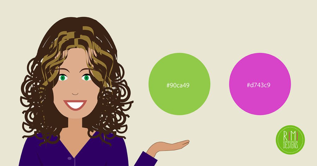
Use complementary and contrasting colours

Using opposing colours helps your design to create maximum contrast and maximum stability. Contrasting colours help graphics or typography to stand out to the viewer.
Use black and white
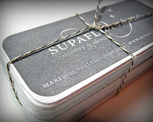
Black and white printing is the most cost effective. You may want to opt for high contrast and reversed type or strategic white space to get the point across. Black also helps to further strengthen the look of your design.
Use patterns and textures
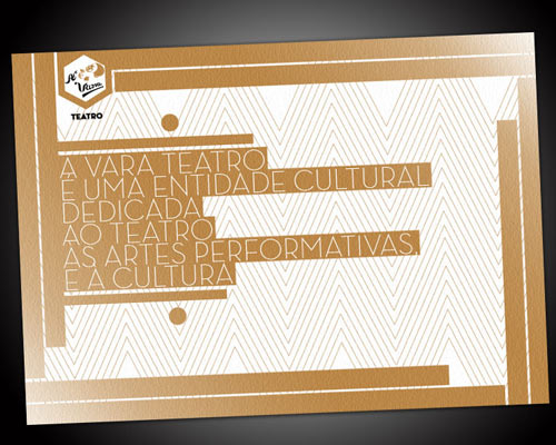
By applying patterns and textures, they will help you produce incredible and unique design pieces. Patterns and textures give your work more interesting visuals, especially when you are limited to using 2 colours. They suggest movement and lead the eye all through the content of the work.
Choice of paper and print
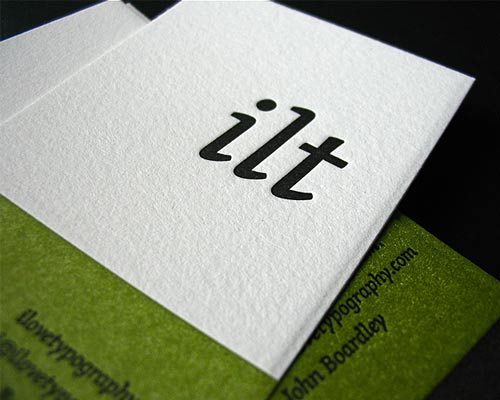
One good technique of making your print work (especially name cards) and look really classy is letterpress. Letterpress is one of the oldest printing techniques, where a raised plate or type is inked and pressed into paper, resulting in a sharp image that leaves a lasting impression. Choosing the right combination and of paper and the style of print will definitely give an edge and elegance to your design.
SOURCE: Onextrapixel
Are you after a business card that will make you stand out and get you noticed? Rimidesigns will design an amazing looking business card for you.

