10 Awesome Newsletter Design Hacks for Emails That Convert
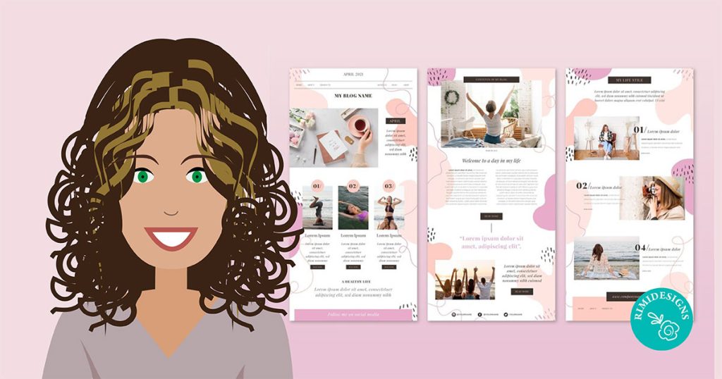
Email is far from dead. So it’s time to start working on a newsletter design that converts. Whether it’s for a corporation or your personal brand, email has the power to
- connect you with a large audience frequently and consistently
- keep the costs of sharing new information low by cultivating a channel of your own
- allow you to scale an engaging content program quickly
- share compelling calls-to-action to steer your audience in a specific direction
As you design your next newsletter, take into account these 10 design hacks to increase your chances of converting that email recipient.
1. Make it responsive
No, responsive doesn’t mean that I still have to pinch and zoom. I won’t, and most users won’t. Your newsletter is better off adapting to your audience’s smartphone/tablet screens.
As you work on this, make sure that CTA (call-to-action) buttons, headers and images are visualised correctly. Most email marketing tools include mobile previewers, but there are other amazing tools to verify just how responsive your design really is.
2. Design with hierarchy in mind
The faster you get acquainted with the fact that most people skim, the easier it will be to design an email that users actually enjoy receiving.
Use typography to feature different areas of your email’s body, highlighting the most important details with font size, type and colour. Email recipients should be able to tell which are your main titles and subtitles to browse accordingly.
3. Mind your subject lines
Many creative professionals have this harmful idea that all design does is ornament drab pieces and add splashy graphics. Nothing could be farther from the truth.
Design is a holistic discipline that provides insightful solutions for human problems. Therefore, when dealing with email design, subject lines are absolutely a design affair. Do your research. Evaluate how including emoji, shorter phrases or using a more conversational tone impacts conversion.
4. Sometimes just completely break the rules
OK. Occasionally, the only way to break through the intense visual clutter that we’re all buried in, is to bring in something radical, unexpected and compelling.
Differentiating your message in an ocean of boring marketing emails often takes adding a human touch, like including hand-drawn notes in your emails. Is there anything more human than our handwriting?
5. Test it out
Nobody has the end-all formula for email marketing success. Every audience is unique in its preferences and needs, so constant testing is the only efficient way to fine-tune design and copy.
Did you know, for example, that millennials prefer minimal fonts, while baby boomers go for larger ones?
Some of the design tests that you want to experiment with include:
A/B testing
Launch and test alternative subject lines, copy and different design elements. Your email marketing platform will most probably offer this feature. Look out for it in the pricing scheme they are offering.Squint test
Squint your eyes to see which parts of the email template stand out the most. Your call-to-actions should be the most noticeable when you’re squinting.
Squinting allows for the same “quick glance” view that most users have when they’re scanning through emails. So make sure that a simple glance at your email reveals the few important pieces of information that you want to convey.5 second test
Alternatively, use this tool to conduct a 5 second test on your email design. In essence, you will ask respondents what they remember from your newsletter after 5 seconds. These respondents can be friends, prospective clients or colleagues.
6. Seek inspiration constantly
One of the most efficient ways to become better at something is to learn from the best. Sites like Really Good Emails and Mailchimp’s Inspiration page can do wonders for your visual perspective. With best practices changing every single day, it’s important to stay on top of emerging trends.
7. Unleash the power of visual
With so much text filling up our inbox, highly visual emails can be a much-needed relief for our audience. Include engaging visuals that illustrate the product/service that you are sharing.
8. Compartmentalise Content
Design a layout that is easy on the eye. By adding a good amount of whitespace and clear section divisions, you are preserving clarity for the email recipient.
As you design the layout, make sure that the following three sections are distinguishable:
- Header
- Body
- Call-to-action
9. Highlight your call-to-action
What is your ultimate goal for these email recipients? Is there a particular action that you’d like them to complete? Make sure that your newsletter’s main call-to-action is visible and predominant. Test whether buttons or plain links work best for you.
Many experts, however, will recommend going for buttons instead of links, since the first are most commonly associated with web actions.
10. Stay tuned for new email design tools
Subscribe to your email provider’s blog for updates on their newest features. Staying on the loop means that you’ll be the first to know when new tools that impact conversion become available.
SOURCE: Canva


