15 Great Logos with Subliminal Messages

Uncovering their secrets, here are 15 popular brands with subliminal messages in their logos!

1. WINE FOREST
Wine Forest’s logo shows a bunch of Sleeping Beauty-like trees with scary-looking branches. Look closer and these trees also double as 3 wine bottles with cracks in the glass.
2. HANDY DOG
Handy Dog’s logo features a hand creating a shadow puppet of a dog against a white sphere. Everyone loves shadow puppets. Way to cater to the masses, Handy Dog.
3. FOOD PHOTO BLOG.COM
FoodPhotoBlog.com, besides sounding like a site we need to bookmark ASAP, also features a nifty logo. There is a plate and cutlery on top of the company name. These also double as a camera lens.
4. OCULAR INK
Ocular Ink keeps things literal in its logo. Ocular is in white font and the o and c form a pair of eyeglasses. A drop of pink ink in front of the logo plays up to the Ink part of the name.
5. COFFEE NIGHT
Coffee Night’s logo shows a mug full of coffee and a brown background. Look closer and you notice just how awesome this logo is. The simple brown background actually has wood patterns on it, so the mug is resting on a wooden table. The foam from the coffee forms a crescent moon. Way to pack a lot of detail into a simple logo, Coffee Night!
6. WIESINGER MUSIC
Look at Wiesinger Music Piano Service’s logo and you’ll have no doubt as to what business they’re in. The W and M both feature piano keys.
7. CROWD
At first glance, it just looks like a child scribbled over the background of Crowd’s logo. Look closer and you’ll notice that the background noise is actually the word crowd written over and over again. Crowd is literally standing out from the crowd.
8. MOON
Moon’s logo shows silver letters on a black night sky background. Each individual letter also represents a phase of the moon. The ‘M’ takes some stretch of the imagination but is so cool, we’ll just let it slide.
9. BOXSIT
Boxsit’s logo is on a background of simple brown, the same colour of cardboard boxes. What appears to be a white folding chair also doubles as an open box. Now that’s “Boxsit”.
10. BOOK COVER CAFE
Book Cover Cafe is a place for book lovers to sit and enjoy a cup of java while reading. The icon is both a cup of steaming coffee and an open book. Now that’s crafty.
11. CATCH ME!
Catch Me!’s logo features a falling man with a speech bubble that states the company’s name. When you look at it a different way, you see that his body and legs also form the shape of a palm that’s catching the man. Clearly, this is one company that’s ready to give you a helping hand.
12. AIRTIME
Airtime’s logo is a simple blue clock with white hands. Makes sense. What takes this logo to the next level is the angles of the hands which form an aeroplane.
13. WEB GIRLS
Web Girls is a company that markets to women. The logo features a simple mouse cursor and dot on top of a female-friendly pink background. The angle of the dot and mouse cursor form a woman wearing a dress.
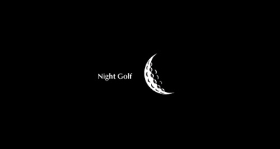
14. NIGHT GOLF
Night Golf is a UK company that gives golfers light to play the sport at night. At first glance, the logo just looks like a crescent moon. What you thought were moon craters are actually the classic pits on golf balls. How clever!
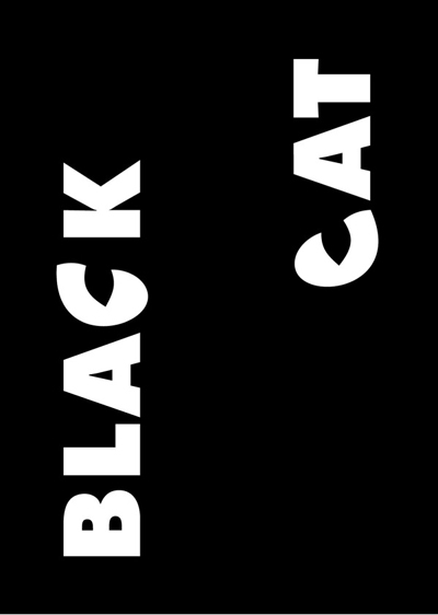
15. BLACK CAT
We’ll admit it, the first thing we did was tilt our heads sideways to read this logo. The reason the words are sideways is so that the C’s can form cat eyes. The company even tilted the C’s so the eyes look feline.


