Choosing the Right Logo Style for Your Brand
A successful business logo must not only be memorable, reproducible and versatile enough for all formats (from print to web), it must also state clearly and distinctly who you are as a brand. Sounds daunting, but don’t get discouraged.
Let’s break it down on how to choose the right logo style for your brand, using a few basic examples.
Wordmark
 Everyone recognises the Google logo. The combination of bright colours and bookish font say a lot about what Google does.
Wordmark logo styles such as this rely on typographic treatment with few (if any) illustrative elements to make a clear statement about a brand.
When choosing the right style for your brand, wordmark style logos have the advantage of simplicity and can push a fun, interesting or catchy name to the forefront of the marketplace.
Lettermark
 Lettermark designs use acronyms, initials or abbreviations and rely on typography rather than illustration to reinforce brand identity.
One example is the CSX logo. When the Chessie System and Seaboard Coastline railroads merged, they needed a corporate logo that embraced both companies.
As the story goes, a placeholder was needed for legal documents before any logo could be created, so someone came up with CSX (C for Chessie, S for Seaboard, and X for the intersection of the two).
Lettermark logos are ideal when the full brand name is either long or cumbersome, or when you need to link subsidiaries to a parent brand.
Brandmark
 One bold, simple illustrative element can say a lot about a company. The “bitten apple” of Apple computers is instantly recognised worldwide, yet contains no typographic elements.
Brandmark logos are perfect when you want an internationally discernible design that is easily transferred to any format. But make your choice carefully. Customers need to associate the logo (and the style) with your product or service.
The Nike “swoosh” is a great example of a brandmark that uses implied motion to communicate athleticism and speed.
Iconic
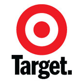 You may find that the best style for your brand is a hybrid, falling between a brandmark and wordmark style. Using both typographic and illustrative elements, iconic designs can create a mini narrative about your brand. The elements can be used together or separately, depending on the medium.
The red and white bullseye of Target stores is one example. The bullseye is an effective brand identifier, with or without the word “Target.”
Iconic designs also have the advantage of offering a more varied concept palette.
Whatever the logo style you select, be creative. Remember that in addition to being bold, unique and reproducible, your logo must be communicative of your brand’s strengths. The elements — typographic and illustrative — will set the tone of communication between you and your prospective clients.
Look at your brand assets — stability, inventiveness, action, cohesiveness, interconnectedness, timeliness — and choose the style that best expresses both you and your brand.
SOURCE: 99 Designs
A good logo should reflect the spirit of your brand. Need a professional looking logo for your business?


