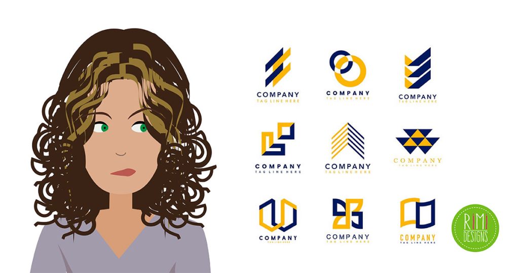
How to Steer Clear of a Generic Logo
Boring. Tired. Uninspired. You wouldn’t use any of these words to describe your work, would you? Take a moment to ask yourself what you do want your logo to say?
By investing a bit of time and energy at the beginning, you can maximise your potential and quickly learn to tell a distinguished logo design from one that’s a dime-a-dozen.
1. Do your homework
You might not know exactly what you’re aiming for when you start brainstorming, but you can make sure you know what not to do!
One way to stir up some ideas is to do a Google Image search for logos in your industry. For instance, if you’re designing for a coffee shop, run a search for “coffee shop logos”. If you’re working for a vet, look up “veterinary logos” and so on and so on. You’ll be amazed by the variety – and the similarities – of the designs you find in virtually every industry.
Take note of what design elements you like, what styles and iconography are repetitive (hint: you don’t want to design like that) and the fonts and colour schemes that appeal to you. Be sure to save your favourites for future reference.
Take time to browse design blogs and online publications to see what’s out there. Investing the time to do your homework before jumping in, can help you develop a better eye for what’s unique and eye-catching – and what’s going to fizzle in the background.
2. Keep your design simple… but not too simple!
While simplicity is the key to a well-designed logo, a simple logo doesn’t mean a dull one. It’s one that isn’t overly designed, but still has lots to say.
One good way to craft a unique logo is to avoid designs based solely on very basic or generic shapes.
For instance, you may want to project the “star qualities” the company offers. That doesn’t mean you should be using a literal star to get your message across. Think outside the box for other ways to interpret that selling point. And if it’s crucial to use a star shape, you’ll need to find a way of making sure you use it in a way that is uniquely you.
Spend time looking at how companies have successfully incorporated shapes into their logos. Again, a quick image search for phrases like “star logos” or “triangle logos” will allow you to see thousands of designs featuring those shapes. Chances are, you’ll quickly be able to discern the compelling ones from the duds.
Conclusion
Remember, the simpler the design, the better odds it’s been done before. Aim for designs that communicate your company and its values at a moment’s glance.
Take the time to read the brief and work hard to deliver designs that resonate with each business. Recognising each company’s uniqueness and finding way to visually communicate those qualities will have you well on your way to creating a logo that isn’t the least bit boring.
SOURCE: 99 Designs
A good logo should reflect the spirit of your brand. Need a professional looking logo for your business?


