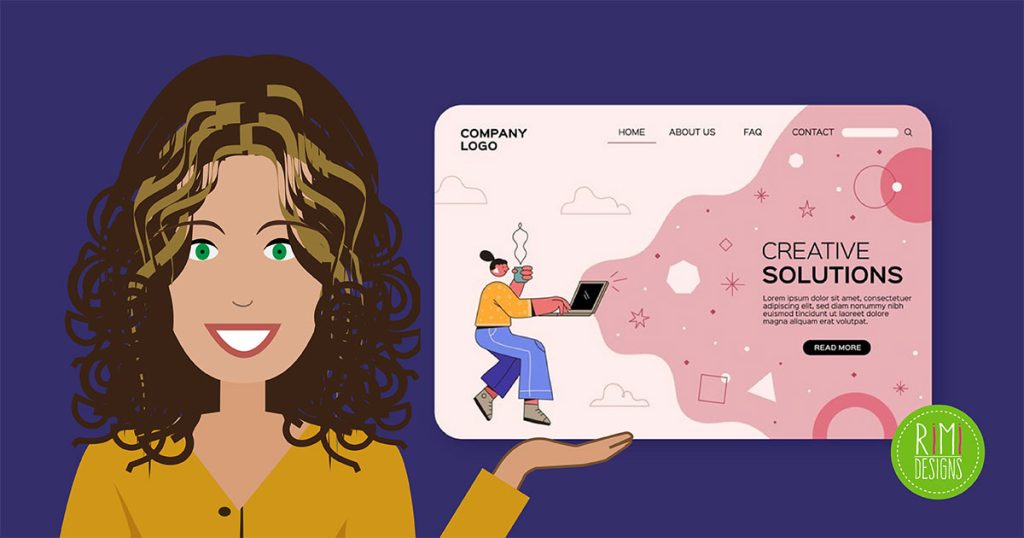
The Anatomy of an Effective Landing Page
There are many different ways to run a business online and methods will vary depending on the industry, the target customer and many other factors.
Marketers are often concerned with gaining online exposure, increasing visibility and attracting web traffic but the ultimate (occasionally overlooked) goal for all online businesses is not simply generating interest — it’s generating revenue.
In other words, all marketers are in the business of taking visitors and potential customers and transforming them into buyers and users. This is the purpose and intent of landing pages. A landing page is, in most cases, the first thing a visitor will see after clicking on, let’s say, a web advertisement.
Note that a landing page is not necessarily your home page. It is a carefully-crafted page that you send visiting traffic to “land on”. Essentially, the job of a landing page is to prompt the visitor to take a certain action, be it purchasing, downloading or signing up for a membership. An effective landing page captures the viewer’s attention, hence the sometimes used term “lead capture page”.
In all honesty, your website could be designed by the best designers in the industry but if your landing page is lacking, you will most likely end up with a pretty website and not a lot of business.
Don’t get me wrong, pretty pages have their appeal, but if you’re not converting those people to customers or members, you’ve wasted a critical opportunity. So, how do you convert your visitors into customers? The short answer involves repeatedly optimising your landing page by improving what you have, adding what you lack and removing content that may be turning visitors away from your products or services.
The following are some common focus areas that can be polished to perfection with careful study and constant iterations.
Content
Headline
Your headline is the first thing that most visitors will see when they arrive at your landing page and this should be one of the largest and most thoughtful elements on your page. Not only does the size matter (because you want to grab their attention) but so does the headline’s content.
Your headline should be engaging and compelling. Not only that, but it should be consistent in its wording to compliment the advertisement that lead the visitor to the landing page in the first place.
In other words, if your advertisement is making some king of promise or offer, your headline must match it with absolute perfection.
Placement and size are important when it comes to having an effective headline but don’t forget to stay clear and concise.
Body
The body of the landing page is the most crucial part because this is where your main information will be presented. Visitors who get as far as the fine print are seriously considering your offer, so it’s critical to have concise, compelling information that transforms the viewer from a curious, considering visitor into a bona fide customer.
Despite your body copy serving a very important purpose, you will want to avoid putting so many words on your page. Customers leave when they deliberately decide against buying your services. But they also leave if they simply get bored or distracted.
Think of your landing page as a billboard sign. Do not overcrowd the space you have and only include the absolute essentials. As far as images go, don’t be afraid to utilise them, because in some cases you can swap out words for images or videos.
Remember, that if you are using videos or images, make them large enough for people to experience without straining their eyes.
Call-to-action buttons
Call-to-action buttons (or CTAs) are also extremely important. None of your other painstaking efforts will matter, if your call-to-action isn’t clearly visible and highly attractive.
When creating your CTA, make sure that it describes explicitly to your visitor what they are doing. Effective CTAs will generally show a step-by-step process, illustrating what the visitor will be doing and what they will gain in the end. Doing this makes your CTA clear and leaves your visitor feeling confident in their actions.
Effective CTAs also use strong, decisive wording to catch the attention of viewers. Consider using wording like “Download Now” in lieu of something like “Try It”.
Ultimately, where you place your CTA depends on your design but just make sure it has a prominent position where it’s always visible.
Trust indicators
Many landing pages require visitors to enter in somewhat sensitive information, such as email addresses and phone numbers, so trust and credibility is a top priority.
There are several ways to prove that your website is legitimate and trustworthy, one of them being testimonials. Always consider showcasing positive feedback on your website, if you have it.
Security certifications are also worthy enhancements for websites that allow online purchasing. Websites that use some form of security certification, generally see an increase in both their sales and revenue.
Just ask yourself whether you would trust your website if you were a visitor. If the answer isn’t a definite “Yes”, then you should consider adding some form of a trust indicator. If you don’t need a security certification or don’t have any feedback to use, think about offering a risk-free trial to allow visitors to try your product out beforehand.
Lastly, if your products or services have been featured or reviewed (positively) by reputable brands or media outlets, consider including these as additional testaments to your own credibility.
Design
Above the fold
When designing your landing page, think about the way that billboards operate.
When you’re on the highway, you only have a few seconds to read a sign. You don’t have to look all over the place. The offer is right there in your line of sight.
Above the fold designing means that you are designing your page much like a billboard. If you are designing above the fold, there is no reason that visitors need to scroll down to read pertinent information.
Now, this doesn’t mean that you shouldn’t have a scrollable page but it does mean anything that you want visitors to see and know should not be in the bottom half of your design. If you currently have information that should be at the top of your page but isn’t, consider rearranging elements, in order to rectify the problem.
Colour
No matter if it is for your website, logo or even product packaging, the wrong colour choice can ruin your design and the right choice can potentially draw in many more interested visitors.
As we all know, colour has an effect on the viewer’s emotions, so picking the right colour is important. Consider researching about different colours and their meanings to see what colour will be the best fit for your website.
For example, the use of black in web design gives your website a sophisticated look, while blue provides a sense of security.
Placement
When you are rearranging your page elements, try to place similar elements next to each other, as this will make your layout cohesive and organised.
Don’t hesitate to utilise white space, as you do not want to overcrowd your page by placing elements on top of each other.
Try going for a minimalistic feel when placing your content on your landing page to let your visitors know that you made deliberate choices and offered a very concise offer for their limited time and attention.
Size
In regards to size, go big or go home.
As already noted before, your headline should be fairly large to capture the attention of your visitors. This principle is equally effective with images and videos.
Elements such as CTAs should also be big enough to be impossible to miss, but not too big that they dominate the entire page.
Try using different effects, such as drop shadows and thick outlines, as techniques to call attention to certain elements without having to make them larger.
Conclusion
As you can see, it doesn’t take secret knowledge to optimise your landing page but these simple changes and additions will not only help your landing page stand out, it may also help increase your conversion rate.
To see what works best for your particular website, always test out different versions to see which works best with your visitors.
SOURCE: SitePoint
Need professional assistance creating a great landing page?


