The Fundamentals of Responsive Website Design
The days of designing a website for a single desktop screen are well and truly over. Technology and the expansion of mobile websites are pushing web designers to rethink how their work is displayed across various devices.
What is responsive website design?
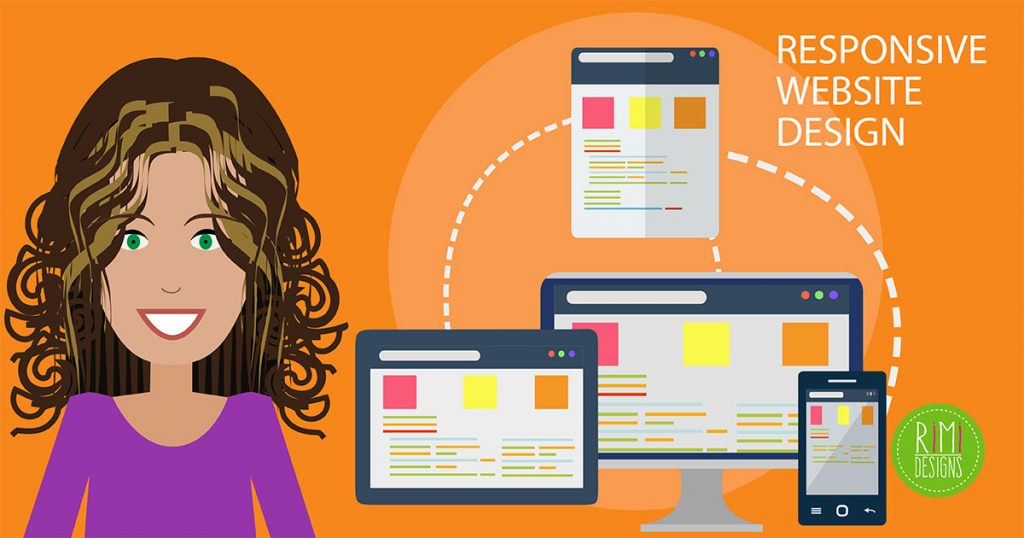
Responsive website design is an approach that allows design and code to respond to the size of a device’s screen. Meaning it gives you the optimal viewing experience, no matter what device you are using.
The best responsive websites essentially utilise fluid grids, flexible images and CSS styling to alter the website’s design and render it according to the width of the browser.
For designers, the ultimate goal should be to seamlessly tailor the UI and UX of a website design across different devices and platforms.
Why is responsive design so important?
If we designed and developed countless versions of a website that worked for every known device out there, the process just wouldn’t be practical timewise and it would be extremely costly! It would also render websites ineffective to future technology changes and make them nearly impossible to maintain. Responsive design is an effective solution to futureproof your website.
A major key to responsive web design is knowing your audience and what device they’re using to view your website. How much of your current traffic is desktop vs tablet vs mobile?
It’s critical to design your website for varying devices, but it gets more complicated when designing across varying web browsers. Each major web browser has its own mobile version and renders websites differently.
Where it gets even trickier is that there are many versions of browsers that need to be catered for — you can’t expect everybody to be on the latest version. So it’s important that the design works and responds to a variety of browser versions.
What website dimensions should I design for?
There is no “standard website size”. There are hundreds of devices out there and model sizes and screen resolutions change all the time. And each individual website attracts users on different devices. You can find out what browsers and web page sizes are most popular for your website by looking at Google Analytics.
So with endless combinations of browser sizes and devices, how on earth do you design responsively without losing your mind?
Try designing at least 3 layouts
A responsive website design should have at least 3 layouts for different browser widths.
-
Small
Under 600 px. This is how content will look on most phones. -
Medium
600 px – 900 px. This is how content will look on most tablets, some large phones and small netbook-type computers. -
Large
Over 900 px. This is how content will look on most personal computers.
Each of these layouts should include the same text and graphical elements, but each should be designed to best display that content based on the user’s device.
Scaling down the page to fit on smaller screen sizes will make the content unreadable, but if you scale the content relative to one another and switch to one column, then it makes it much more easier to read.
Things to think about
-
User experience is key
Responsive design needs to be more than converting a desktop website into a mobile screen. You need to consider the user’s experience, their interaction and the essential content they’re actually looking for while using a mobile device. -
Don’t design for the latest mobile device with a specific screen dimension
Instead, design your website around your content. How will the layout and elements work on desktop and how will those same elements adapt to each other on a mobile device? -
Engagement
The hierarchy of the layout is super important, especially on mobile. Often less is more! The mobile experience compared to desktop is much more focused with a limited amount space, so the way users read and move through your site needs to be really clear to get across your key message and understand what the site is all about.
Also think about the main action of the page. If the key goal is to get people clicking a “Contact Us” button, then don’t hide it down the page underneath slabs of text. Tailor your content and design around that experience. -
Flexible images
These are really important to designing a responsive website. You need to think about how an image will scale. How will it look on a large desktop screen vs a tablet vs a small mobile screen? From a development perspective, the code will allow images to scale via a percentage value to the width of the browser window. -
Navigation
Navigation is important on mobile. There are several common methods for collating large menus and content. It could be in the familiar hamburger style menu, a simple drop-down selection, expand/collapse fields or you could use tabs that scroll horizontally. -
Gestures
Gestures open up new possibilities for design. People love reading with their hands and interacting with the content — it empowers the user.
On mobiles and tablets, users can pinch to zoom or slide images across the screen. Interaction greatly affects the design. For instance, if you have an image gallery try avoid using a standard carousel (small dots) to let people cycle through each image. Think about the size of a person’s finger and how that translates into a useful UI solution.
Complex desktop designs need to be able to adapt to simple intuitive UI for a small mobile screen. Always keep this in mind when designing for different devices. The design has to be flexible so it creates a great experience across all devices for users.
Tools and resources
-
Web browser
Your web browser might seem like an obvious tool to use, but it’s the most effective resource to preview your designs on the web. Install a few different browsers to get a good range of feedback. Then start resizing the browser windows. -
Mobile device
Your mobile device is another obvious tool to use but really helpful to preview your designs on because it shows you exactly what your website will look like under those specific conditions. -
Fluid grids
Fluid grinds are based on designing a website layout on percentage values instead of set pixels. For instance the width of content on a desktop screen could be 930px, but you want to target the design down to 320px on mobile. To convert this into a scalable figure, the result works out to be 320/930 = 34.4%. When you apply this to the mobile screen size the elements in the design layout will resize in relation to one another. -
Google’s resizer
This is a good resource to quickly preview your site on multiple devices. -
Media queries
This is a type of code that will get implemented into your website when it gets built. It’s important to have in your code because it sets the conditions for the design to magically adapt to the size of the screen.
Source: 99 Designs


