Why Are So Many Logos Blue?
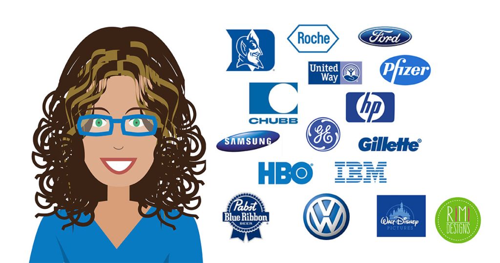
If you look at some of the most successful logo designs and branding campaigns in the tech, insurance and media world today, you will notice the predominance of the colour blue. Ever wonder why so many brands decide that blue is the perfect anchor for their colour scheme?
Here we’ll take a look at the colour blue, the message it conveys to consumers and why so many companies choose blue for their logo design.
Ask around. Blue is most often named as the world’s number one favourite color. In fact, over half (53%) of the world’s flags contain some shade of blue.
Psychologists and sociologists cite blue as being “calming” and “inspiring of confidence”. This may be because the elements of nature where we tend to find blue — the ocean and sky — are among the most enduring.
Blue also has a long history of representing the aristocracy (blue bloods), perhaps because blue dyes were harder to produce in the pre-industrial era and therefore were affordable only to the wealthy.
A blue suit is still a universal symbol for professionalism. It says “we’re stable, prudent, responsible and here for the long game”.
Biologically, the human eye reacts to blue by seeing it as a receding colour, which makes it a perfect background for white type. Reds are often associated with alarm or speed, while yellows indicate caution.
In the business world, many heavy hitters base their brand on one shade of blue or another. Blue Cross/Blue Shield even incorporates the word “blue” into the name, in case you missed the big cross and shield — both protective symbols, emphasising safety and security. In fact, about two-thirds of insurance companies use blue.
Transportation companies like JetBlue Airways and Greyhound Bus Lines also use blue to inspire feelings of confidence and safety.
The tech and social media industries are packed with blue brands. Facebook, Skype, WordPress and Tumblr all use blue as the basis for their logo’s colour palette.
Some of the largest tech and computer companies like IBM, Hewlett-Packard and Intel use blue as their sole colour. And many others feature blue as part of a broader colour palette. Why? Most likely because blue is the colour most often associated with trust and stability.
So when considering a colour palette for your brand, think about not only the type of message you want to convey but also about the way the human eye and mind react to certain colours. If an image of stability and reliability is an essential feature of your brand, you might want to get a case of the blues.
SOURCE: 99 Designs
A good logo should reflect the spirit of your brand. Need a professional looking logo for your business?


